My goal for this series was give each school their own distinct look and to make the league as diverse as possible, while still keeping the integrity of each school's history and designs intact. The schools will be presented in alphabetical order.
BOSTON COLLEGE
The Eagles are the two-time defending Hockey East champions, and winners of five of the last seven. On Friday, they will face the Providence Friars in the semifinals, for the opportunity to advance to a third straight finals appearance.
BC currently have new uniforms for the 2012 season, featuring gold and maroon racing stripes (vertical arm stripes), hem stripes, and sock stripes. The road uniforms are the same, with white stripes replacing the maroon ones. While these uniforms are okay, they aren't nearly as nice as their previous uniforms. For this concept, I wanted to return to a look similar to those previous uniforms, in which the Eagles won three national championships. The crest on the front remains unchanged, and the sleeve stripes are only slightly different than the ones on the old uniforms. The biggest change are the road pants, which are gold, and feature a double stripe that matches those on the sleeves.
 |
| Click Image to Enlarge |
BOSTON UNIVERSITY
The Terriers are also playing in this weekend's semifinal, against the University of Maine, and are attempting to regain the championship for the first time since 2009, when they defeated UMass-Lowell in the championship game.
BU wears two different sets of uniforms. The primaries are similar to the Boston Bruins cut (if the full yokes were removed) while the Alternates are Detroit Red Wings-esque. For my concept, I wanted to keep a similarly classic look, and created a design that somewhat combined both uniforms while also being fundamentally different from each in the process. The arched Boston and number remain, while the sleeves are a contrasting color with a smaller stripe of the same color located higher on the sleeve. Both the hem stripes and sock stripes feature this stripe pattern. Finally, I added the BU logo as shoulder logos.
 |
| Click Image to Enlarge |
MAINE
The Black Bears are the team of my rooting interest, and are facing BU in this weekend's semifinal. If the Black Bears win, they will make their second appearance in the Final in three years. A championship victory will be the first by a team not named BC or BU since 2004, when Maine defeated UMass.
Maine's uniforms are nearly perfect, featuring a classic double-blue color combination with triple stripes on the arms, hem, shorts, and socks. The crest on the front is a cursive "Maine" wordmark. To me, the only thing wrong with these uniforms are the shoulder yokes, which just don't appeal to me. In my concept, the only thing I did was fix the shoulder yoke to match the style of the rest of the uniform striping.
 |
| Click image to Enlarge |
MASSACHUSETTS
The Minutemen were eliminated by BC in the quarterfinal round.
UMass currently have uniforms with the wordmark/number combo as a crest and Northwestern striping. They are okay, but could be much better. For my design, I wanted to a combination of a modern and traditional look. UMass has a logo that uses black and silver liberally, so I figured I would include those in the uniforms to give them a bit more pop. The striping on the uniforms is a Red-Silver-Black design that I made standard throughout the entire set. On the road uniforms (or any other red portion) the striping stays the same, but the red stripe matches the uniforms, and disappears (trust me, it looks way better than a white or silver shoulder yoke). I also placed the minuteman logo on the front to round things out.
UMass-Lowell
The Riverhawks were eliminated by Providence in the quarterfinal round and are the first two-seed to lose in the quarterfinal round.
I personally am not a fan of UMLs uniforms. The home unis are Montreal Canadiens clones with blue helmets. The road unis have a generic three stripes and shoulder yokes design. I feel like there is a red uniform too, but I'm not sure if they still use it. Anyway, neither design really strikes me. I also have an issue with the fact that the design seems to struggle deciding whether red or blue is the primary, ala Texas Rangers.
For this design I wanted to:
1) Choose a primary color. Like I said, having blue and red clash for primary status isn't a good idea, so for this concept, I made blue the primary color.
2) Modernize the uniforms. I'm not particularly a fan of every Hockey East team wearing a traditional uniform... UML is one of those teams that got bumped out of the traditional category.
3) Change the script on the uniforms, I hate how it looks currently.
The uniforms feature red paneling with white accent piping on the jersey, pants, and socks. I also decided to make the wordmark on the front diagonal, as it made the uniform look more even than any other attempt.
Merrimack
The Warriors were eliminated by Maine in the quarterfinal, in a rematch from last year's quarterfinal matchup, which Merrimack won.
Merrimack's uniforms are two completely different styles. Their home uniforms are yellow with a white-blue-white torso stripe (and sleeve stripes to match) with the school's MC logo as its crest. The road uniform is navy, with yellow double hem and sleeve stripes. I know in the past that the numbers on these looked like highlighter yellow when viewed in person (though images of the uniforms don't seem to portray that). The crest on these uniforms is a Merrimack wordmark.
I am not a fan of having two different designs, especially when they are that different, so my first goal was to make a single uniform design for both home and road uniforms. My second goal was to make Merrimack look more modern. Both uniforms give a sense that the Warriors have lots of history in Hockey East, which is very far from the truth. In fact, Merrimack was consistently the worst team in the league for years, and only recently experienced success. That fact made me decide to come up with a modern design for the team.
I love the use of yellow at home, so I kept that look, while giving each uniform shoulder stripes with white piping as well as white and Yellow/Blue (depending on the uniform). Both uniforms use a version of the MC logo The shorts are navy with a white-yellow-white stripe design, and the socks feature a stripe similar to that of the shoulder stripes.
NEW HAMPSHIRE
UNH was eliminated by BU in the quarterfinal round.
The Wildcats have excellent, simple uniforms, so I didn't want to do too much different. The only real difference is the addition of silver, which create a double stripe look. Also, I decided to go with Silver for the home instead of white, I figure it could look pretty good as a light jersey. The only other change is that both shoulder logos face forward.
NORTHEASTERN
Northeastern failed to qualify for the playoffs, finishing in ninth place.
I hate Northeastern's uniforms, which are just a copy of the Chicago Blackhawks uniforms (which I also dislike). Also, the Huskies have one of the worst logos I've ever seen. It's absolutely mind-blowing to me that people actually think this is a good logo and are willing to use it. Anyway... For this concept, I wanted to give Northeastern a new look based around their split-color N logo. In order to achieve this, nearly everything on the uniforms have the same split-color look, most notably with the numbers (I tried shoulder stripes, but they didn't look right).The shoulder logos are the huskies current split-paw logo, which I like a lot.
PROVIDENCE
Providence will face-off against BC in the semifinal. They are the first seven-seed to advance past the quarterfinal round.
The Friars current look is "cookie-cutter" (shoulder yokes, triple arm and torso stripes) and uses this logo, which I absolutely despise. In order to correct the look, I went in the opposite direction. First, I came up with a unique sleeve stripe deign. There really wasn't an inspiration for these, I had another design that failed, so I kept tweaking until I eventually came up with this look, which I like a lot. I also changed the crest logo to the side-profile friar, which I feel is more consistent with the style of the uniforms than the current logo.
VERMONT
I used to love Vermont's uniforms (They were similar to my BC uniforms but in green and yellow). However, recently they changed both their uniforms. The home whites don't look bad, but the road uniforms... Well, they got caught up in that fauxback fad that's been plauging the NHL, and it does not look good.
For my concept, I wanted to remove the awful vintage white and roundel. Finally, I went with a stiping that creates a V on the sleeves, torso, shorts, and socks. I also made the striping and numbering match the same style seen on the V in the crest (yellow-white-yellow on the road uni, green-yellow-green on the home uni).
There you have it, a redesign for all ten teams in Hockey East.
UMass currently have uniforms with the wordmark/number combo as a crest and Northwestern striping. They are okay, but could be much better. For my design, I wanted to a combination of a modern and traditional look. UMass has a logo that uses black and silver liberally, so I figured I would include those in the uniforms to give them a bit more pop. The striping on the uniforms is a Red-Silver-Black design that I made standard throughout the entire set. On the road uniforms (or any other red portion) the striping stays the same, but the red stripe matches the uniforms, and disappears (trust me, it looks way better than a white or silver shoulder yoke). I also placed the minuteman logo on the front to round things out.
 |
| Click image to Enlarge |
UMass-Lowell
The Riverhawks were eliminated by Providence in the quarterfinal round and are the first two-seed to lose in the quarterfinal round.
I personally am not a fan of UMLs uniforms. The home unis are Montreal Canadiens clones with blue helmets. The road unis have a generic three stripes and shoulder yokes design. I feel like there is a red uniform too, but I'm not sure if they still use it. Anyway, neither design really strikes me. I also have an issue with the fact that the design seems to struggle deciding whether red or blue is the primary, ala Texas Rangers.
For this design I wanted to:
1) Choose a primary color. Like I said, having blue and red clash for primary status isn't a good idea, so for this concept, I made blue the primary color.
2) Modernize the uniforms. I'm not particularly a fan of every Hockey East team wearing a traditional uniform... UML is one of those teams that got bumped out of the traditional category.
3) Change the script on the uniforms, I hate how it looks currently.
The uniforms feature red paneling with white accent piping on the jersey, pants, and socks. I also decided to make the wordmark on the front diagonal, as it made the uniform look more even than any other attempt.
 |
| Click Image to Enlarge |
Merrimack
The Warriors were eliminated by Maine in the quarterfinal, in a rematch from last year's quarterfinal matchup, which Merrimack won.
Merrimack's uniforms are two completely different styles. Their home uniforms are yellow with a white-blue-white torso stripe (and sleeve stripes to match) with the school's MC logo as its crest. The road uniform is navy, with yellow double hem and sleeve stripes. I know in the past that the numbers on these looked like highlighter yellow when viewed in person (though images of the uniforms don't seem to portray that). The crest on these uniforms is a Merrimack wordmark.
I am not a fan of having two different designs, especially when they are that different, so my first goal was to make a single uniform design for both home and road uniforms. My second goal was to make Merrimack look more modern. Both uniforms give a sense that the Warriors have lots of history in Hockey East, which is very far from the truth. In fact, Merrimack was consistently the worst team in the league for years, and only recently experienced success. That fact made me decide to come up with a modern design for the team.
I love the use of yellow at home, so I kept that look, while giving each uniform shoulder stripes with white piping as well as white and Yellow/Blue (depending on the uniform). Both uniforms use a version of the MC logo The shorts are navy with a white-yellow-white stripe design, and the socks feature a stripe similar to that of the shoulder stripes.
 |
| Click Image to Enlarge |
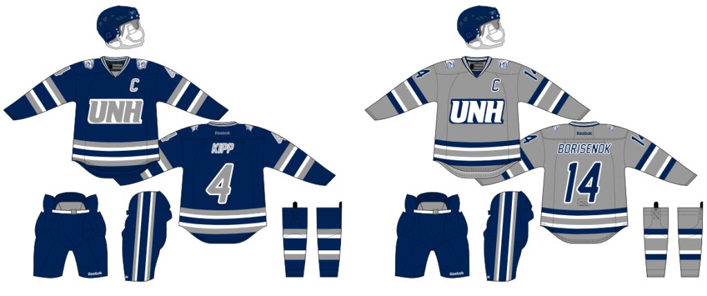
NEW HAMPSHIRE
UNH was eliminated by BU in the quarterfinal round.
The Wildcats have excellent, simple uniforms, so I didn't want to do too much different. The only real difference is the addition of silver, which create a double stripe look. Also, I decided to go with Silver for the home instead of white, I figure it could look pretty good as a light jersey. The only other change is that both shoulder logos face forward.
 |
| Click Image to Enlarge |
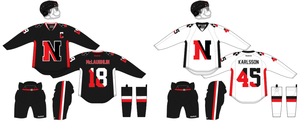
NORTHEASTERN
Northeastern failed to qualify for the playoffs, finishing in ninth place.
I hate Northeastern's uniforms, which are just a copy of the Chicago Blackhawks uniforms (which I also dislike). Also, the Huskies have one of the worst logos I've ever seen. It's absolutely mind-blowing to me that people actually think this is a good logo and are willing to use it. Anyway... For this concept, I wanted to give Northeastern a new look based around their split-color N logo. In order to achieve this, nearly everything on the uniforms have the same split-color look, most notably with the numbers (I tried shoulder stripes, but they didn't look right).The shoulder logos are the huskies current split-paw logo, which I like a lot.
 |
| Click Image to Enlarge |
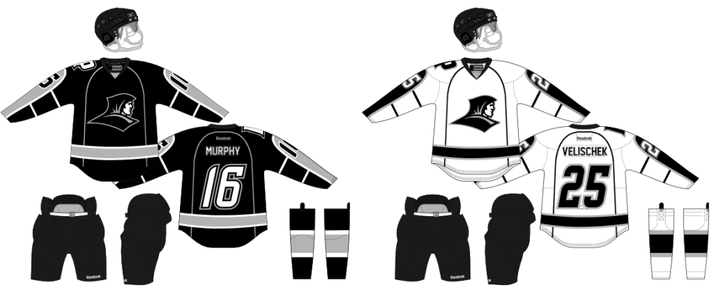
PROVIDENCE
Providence will face-off against BC in the semifinal. They are the first seven-seed to advance past the quarterfinal round.
The Friars current look is "cookie-cutter" (shoulder yokes, triple arm and torso stripes) and uses this logo, which I absolutely despise. In order to correct the look, I went in the opposite direction. First, I came up with a unique sleeve stripe deign. There really wasn't an inspiration for these, I had another design that failed, so I kept tweaking until I eventually came up with this look, which I like a lot. I also changed the crest logo to the side-profile friar, which I feel is more consistent with the style of the uniforms than the current logo.
 |
| Click Image to Enlarge |
VERMONT
I used to love Vermont's uniforms (They were similar to my BC uniforms but in green and yellow). However, recently they changed both their uniforms. The home whites don't look bad, but the road uniforms... Well, they got caught up in that fauxback fad that's been plauging the NHL, and it does not look good.
For my concept, I wanted to remove the awful vintage white and roundel. Finally, I went with a stiping that creates a V on the sleeves, torso, shorts, and socks. I also made the striping and numbering match the same style seen on the V in the crest (yellow-white-yellow on the road uni, green-yellow-green on the home uni).
 |
| Click Image to Enlarge |
There you have it, a redesign for all ten teams in Hockey East.
No comments:
Post a Comment