Thursday, February 23, 2012

Rebranding the New England Patriots


In past posts, I presented different examples of uniform and logo design that have actively been used in the real world. Today, I wanted to divert from that and present a concept design of my own. This concept is a rebrand of my hometown team, the New England Patriots.


It's not that I think there is anything wrong with what the Patriots currently wear. In fact, I like the look (which puts me in the minority) but there are things that I believe could make it better. 


First, I brought back Pat Patriot, the primary logo the team wore in previous seasons. However, Pat Patriot is too detailed to be a quality logo in modern days, so I created a modernized version of the logo. The new Pat Patriot has a sleeker look, with cleaner shadowing and a simplified coat. Pat's sleeves have been rolled up as a representation of the "roll up your sleeves and get to work" attitude of New Englanders. His face has been changed from a happy grin, to an aggressive scowl to better reflect the game of football in the modern era. Other aspects of the logo remain the same, but are rendered in a more simplistic fashion, similar to many designs currently used.


Next, I redesigned the team's wordmark. I'm not a fan of the team's current wordmark. It isn't the worst I've seen, and there is nothing technically wrong with it, the wordmark just isn't my cup of tea. My version of the wordmark uses a custom font with block style letters that are stylized to portray motion and swiftness. The letters are colored with a red (or silver) strip to further enhance the sense of motion.
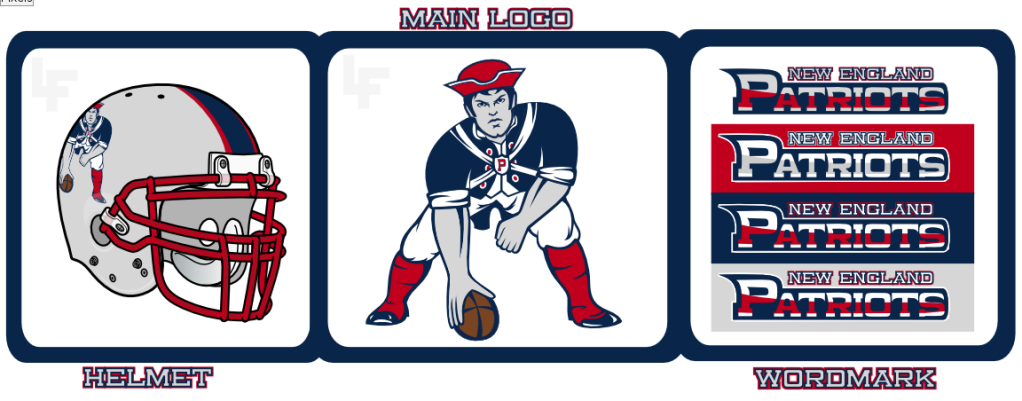

Helmet, Primary logo, and Wordmark
For the secondary logo, I wanted to create something that would not only represent the team, but also the entire population of New England as a whole.

The logo is a tattered red flag, adorned with six stars, each representing a New England state and a green pine tree in a similar style to current the flag of New England. The tattering of the flag represents the perseverance and grit of Patriots as well as of New Englanders, who struggle struggle through even the most difficult hardships and succeed.

Secondary Logo
Finally, I created a uniform set that represents the simplicity of the Patriot Way. The primary home uniform is navy blue, with sublimated stripes on the torso, similar to the Patriots uniforms during the 1990s. The numbers are two-toned, featuring white with a silver strip similar to the design of the wordmark. The pants are silver and contain a blue stripe outlined in red. The stripe design represents the speed and fluidity of the Patriots signature style of offense, which features quick passing strikes. The away uniform is the same design with a white uniform and blue pants.
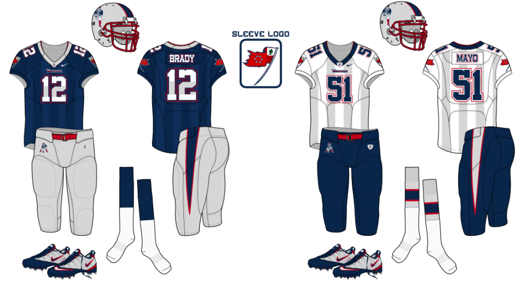


There you have it. In all, this design took me between 3 to 5 weeks to think up and design. Feel free to leave your comments and criticisms on any of the designs.

Thursday, February 16, 2012

But Everyone is Doing It! Black For Black's Sake Edition

Last week, we discussed three trends in sports uniforms over the years, the powder blue craze, the bright-color phase, and the teal and purple years. This week, I will present another trend that has recently taken hold in sports...

 Black for Black's Sake (BFBS) 


Image from uni-watch.com


Black for Black's sake is a trend that describes, according to Uni Watch, "teams that gratuitously add black to their uniform design even though black was never one of their team colors." This trend really peaked during the 1990's and 2000's when it seemed like every team from all levels of sports began wearing black in their uniforms.


In the MLB, numerous teams have added black to their color schemes. However, the five that stand out the most are the New York Mets, Kansas City RoyalsCincinnati Reds, Toronto Blue Jays, and Oakland Athletics. Amazingly, only the Mets still wear a black uniforms, and even that is being phased out of use.


The most notable case in the NFL are the Detroit Lions, who traditionally wore Honolulu Blue and Silver, but added black in 2003. The Lions still include black trim, but phased out the black uniform in 2009.


The Arizona Cardinals, one of the most historic teams in the NFL, sported Cardinal and white uniforms for most of its history, but added black trim in 2005. In 2010, the Cardinals also added a black uniform to their set.


In the NBA, the two most notable teams to use BFBS are the New York Knicks, and the Boston Celtics. While the Celtics only use black in their alternate uniforms, the Knicks have black incorporated into their uniforms full time, something they did not do in the past.


The NHL currently has one offender. The Calgary Flames have historically worn Red and Yellow, but in 1995, the Flames added black trim. Black has been a part of Flames uniforms ever since.


Black for Black's Sake is mostly seen at the college and high school lever, where teams do not have to follow as strict uniform rules (when it comes to changing uniforms) and can add black to their uniforms more freely. 


In college, Oregon is the most obvious offender. In fact, some uniforms the Ducks wear don't even include the school's official colors (Green and Yellow). Of course, look anywhere and you will probably be able to find a team that has worn a black uniform at some point in time. At this level, it is very common.


One common explanation for the craze for wearing black is that black looks tougher than other colors. Others just believe black has become popular because "it looks cool" and can go with any other color. Whatever the explanation, black in sports uniforms (that have not historically contained black) will be around for along time.


 I personally am not a fan of the trend (this does not include teams like the Boston Bruins or Pittsburgh Steelers, who have always worn black), and am glad that many professional teams no longer take part in the trend.

Thursday, February 9, 2012

But Everyone is doing it! Part 1

Earlier in the week, my Rhetoric class was discussion fashion trends that should never have existed. While this was occurring, I was coming up with numerous ideas on different sports trends, and this post was born. Basically, this post will discuss several trends that have swept sports over the years. This will be broken into two parts, with the second featuring three modern trends (late 1990s through today). This week will feature trends of the past that have mostly died out.


The Powder Blue Craze


This is particularly a baseball trend (though the use of double blue is gaining momentum in many sports) since baseball is played in the summer, and teams tend to wear light colors (grey) during away games. So, during the late 1960s and early 1970s, teams began wearing uniforms that were a baby blue color as a way to distinguish themselves from teams that wore grey road uniforms.


The two teams to begin this craze were the Seattle Pilots and the Montreal Expos. While these were not the first two teams to ever wear powder blue (The Cubs and White Sox had worn them decades earlier), these teams marked the beginning of the color's popularity. 


In 1972, two more teams, the Chicago White Sox and the Philadelphia Phillies, adopted powder blue road uniforms. The Pilots also relocated to Milwaukee, becoming the Milwaukee Brewers (and continued to use powder blue). This brought the total to four teams wearing powder blue. 


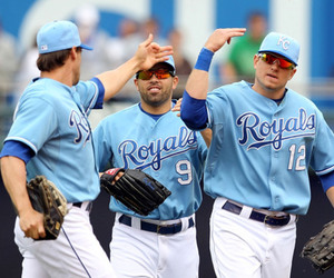
In 1973, two more teams, the Minnesota Twins and the Kansas City Royals, raised the total to six and in 1975, the St. Louis Cardinals and the Texas Rangers joined the craze, raising the total to eight teams. In 1977 the league expanded, creating the Toronto Blue Jays and the Seattle Mariners. Both teams wore powder blue, raising the total to nine, as the White Sox dropped their set.


In 1978, the Chicago Cubs took on pinstriped powder blue uniforms, and in 1980 the total raised to eleven teams when the Atlanta Braves joined as well.


Eleven teams was the highest number ever in regards to powder blue road uniforms. Soon, the trend grew out of style and teams began returning to grey. In fact, not a single MLB team currently wears powder blue as their everyday road uniform (though many have powder blue throwback alternates).


The Colorful Uniform Craze (And the socially awkward pants phase)


The late 1970s and early 1980s gave way to a revolutionary change in sports uniforms. Now, due to technology advancements that allowed for bright colors and designs, teams weren't forced to wear dark colors (like navy blue), they could experiment... And that's exactly what they did.


First up is probably the single most famous example, the Houston Astros. During this period, the Astros sported what is now lovingly (or loathingly) dubbed as the "Tequila Sunrise" look or the rainbow uniforms. Either way, these uniforms were bright, and had a rainbow-esque pattern. Some hate these, some love them, but they were no doubt colorful.


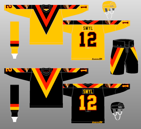
Then, there are the Vancouver Canucks, "Flying V" uniforms. this is widely considered one of the worst uniforms ever conceived, and consisted of a Yellow, Red, and Black color scheme with a giant V on the the front. These featured no crest, and were considerable eye sores.


Many other teams fit this list as well, including the Denver Nuggets, the Chicago White Sox, the Pittsburgh Pirates, the San Diego Padres, and many others.

This era also featured three teams that wore their pants in extremely awkward fashions. First are the Chicago White Sox. For one game, the Sox debuted a brand new look that featured shorts... The look did not catch on, and is still considered the worst baseball uniform ever conceived. 

The other two teams played in the NHL. Both the Hartford Whalers and the Philadelphia Flyers sported long pants known as Cooperalls. Not only was the look disliked, but the pants were deemed a hazard, and promptly outlawed by the league.


The Teal and Purple Craze

During the 1990's for some horrible reason, the colors teal and purple became very popular amongst athletic teams. In every major league, at least one team sported a look featuring one of the colors.


A majority of teams who previously wore these color combinations have since moved away with many either eliminating teal and purple from their schemes, or hiding them behind the color black. In fact, the only teams who still prominently use teal and/or purple are the Sharks, Jaguars, Ravens, and Hornets.


That's all for now, next weeks post will feature the Black for Black's Sake (or BFBS) trend, the Fauxback trend, and "Are you serious?" trend.

Tuesday, January 31, 2012

Carolina Panthers Logo Update

Earlier this week, the Carolina Panthers of the NFL announced the adoption of a new logo and wordmark (seen above) after Nike leaked an image of the logo on facebook. This is the first time in the team's seventeen year history that a change has been made to the logos, similar to changes by the Arizona Cardinals, Atlanta Falcons, and Detroit Lions in previous seasons.


LOGO
The new logo is not that much different to the original, and should be generalized as an update rather than a complete overhaul. Most notably, the Panther was given a more dynamic look, with depth being added to a previously flat looking logo. this was done through the addition of "electric blue" highlights, most notably around the face. 


On the previous logo, this blue was only seen as an outline, and was not placed to provide the illusion of depth, creating a flat logo. Other notable changes have been made to the eyes, nose, whiskers, and teeth, which have been simplified in order to give a sleeker, stylized look. 
The old (left) and new (right) Carolina Panthers logos

WORDMARK
The Panthers new wordmark has also been modernized (drastically). Previously, the wordmark was considered one of the worst ever, and looked as though it was scribbled out using a marker. This gave off a very 90's feel, which was fine during the 1990s, but did not translate well as time went on and styles changed. 

The new wordmark is relatively generic by today's standards (see Lions font in link above). The current font is a modified version of Trade Gothic Bold Condensed Oblique. The most notable changes are the addition of serifs on many of the letters. Also, on several letters, a notch, symbolizing a claw scratch, is added. An exception to this is the A in Panthers, which contains three claw marks. 
Old (top) and New (bottom) Panthers wordmarks

Now, I personally like the new logo and wordmark, and feel that they are an upgrade over the previous set. However, the new logo is extremely sloppy from a design standpoint, reducing the quality. 

First, the eyes. The designer of this logo did a poor job on the eyes, specifically the left one (viewer's right). This eye is especially small and clumsily drawn, giving the appearance that the Panther is squinting, which does not portray ferociousness. 

Next, is the chin. Not only is the chin exceptionally distracting by flowing into the mouth, but it also cuts off the black on the left cheek in an awkward way, which makes that area look pixelated. Obviously this is a tough thing for many to picture with words, so if needed, look at this diagram that helps point out these (and other) design flaws.

The final part of the logo that needs critiquing is the forehead. The Panther's forehead (and ear) area is a complete mess. First, the stroke thickness is very inconsistent, being very thick at points, while getting overly thin at others. In order for a logo to look clean and professional, stroke width should be relatively uniform throughout the logo.


The locations in which the blue lines thin create problems of their own. In these areas (above the eyes, in particular) large chunks of negative space appear. Negative space is okay when utilized properly, but in this case, the negative space is just black, and doesn't provide any depth or motion.


However, the worst part of this entire logo is located just near the right (viewer's left) ear. 


 At this point, where the forehead highlight meets the ear highlight, there is a small intersection point. This is incredibly sloppy, and a very amateur mistake. This small divot takes all the flow out of the logo, making it appear disjointed. In this case, the highlight should either remove this direction change, making the path smooth, or make the change much sharper, adding definition to the change between the ear and forehead. Clearly, I would not expect a casual fan to ever notice something this small, but to a designer, this is a completely inexcusable mistake for a professional (who is hired by the NFL no less) to make.


Fixing all these mistakes would create a much stronger logo, and so you don't have to imagine what this new logo would look like, Fraser Davidson (One of the best logo designers in the world) has developed an updated version of the logo with revisions added. 
From Left to Right: The original, new, and revised Panthers logos

In the end, the new logo isn't bad; to me, it is a definite upgrade. However, numerous design flaws hold the logo back from being phenomenal. Davidson's logo, which addresses the problems, is probably the best I have seen, and gives the panther depth, and ferociousness that the current logo lacks.
Obviously, that is my opinion, but what do you have to say about the logo? Like it? Hate it? I''d like to hear your opinions.


NOTE: Numerous online sources attribute the design to Nike, who has obtained the rights to design the NFL's uniforms starting next season. However, this is incorrect. The logo was actually made by the NFL's creative department.


Thursday, January 26, 2012

Welcome

Welcome to The Logo Creep, the blog that will help educate those with little knowledge of the sports logo and uniform design business. It is my goal to not only reach an audience of design enthusiasts (and sports fans), but also to also reveal the values and discipline needed to be successful in this field.

I myself am an amateur designer. You will likely never see Oregon or the New England Patriots wearing my designs. For me, creating new uniforms and logos in my spare time and showcasing them for the world to see is good enough. Of course, it is always nice to be recognized for that work as well. Case in point, recently I won the Seattle Seahawks Redesign Contest held by Uni Watch.

But enough about me.

Right now, I'm going to answer a question you probably asked when you first arrived. What the heck is a logo creep?

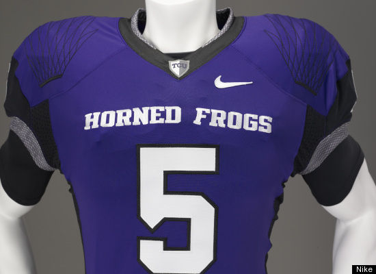
A logo creep, simply put, is when a uniform manufacturer places the company logo on a sports uniform in a location visible to viewers. The idea behind this is all marketing. If a person sees a uniform that they like, seeing the brand logo will make that person more likely to buy more products from that brand.

Nike logo creep seen on TCUs football uniform


Some people dislike this trend, as they believe it makes the uniforms as much about the manufacturer as it does the team that is actually playing. They feel that sports should be about the team, not the manufacturer, and that by adding the logo creep, companies are degrading the value of the design (I personally don't have that big a problem with it, if the creep isn't overwhelming).


The title Logo Creep also has a second origination. A few years back, it was highly uncommon for a person to be interested in uniform design. People didn't understand my fascination with design, and this occasionally made me the butt of jokes. Of course, being "weird" didn't deter me, as I found a community of others who were fascinated as well. The title is a reference to me being weird, or "a creep" for liking uniform and logo design.

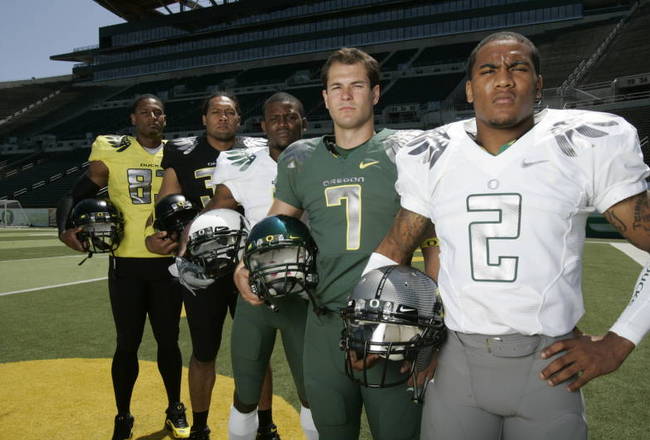
Of course, in 2008, Nike (who I absolutely love) released new uniforms for the Oregon Ducks football team, catching the eye of casual fans. 
Oregon's new uniforms
So now uniform design is becoming somewhat popular amongst the masses of sports fans, which has resulted in both positive and negative outcomes and trends (I will expand on this in future posts).

For now though, I'll leave you with this welcome. Oh, and if you have any other questions or even suggestions for a future post, feel free to comment, and I'll accommodate you as best I can.